International School Manila
PROJECT OVERVIEW
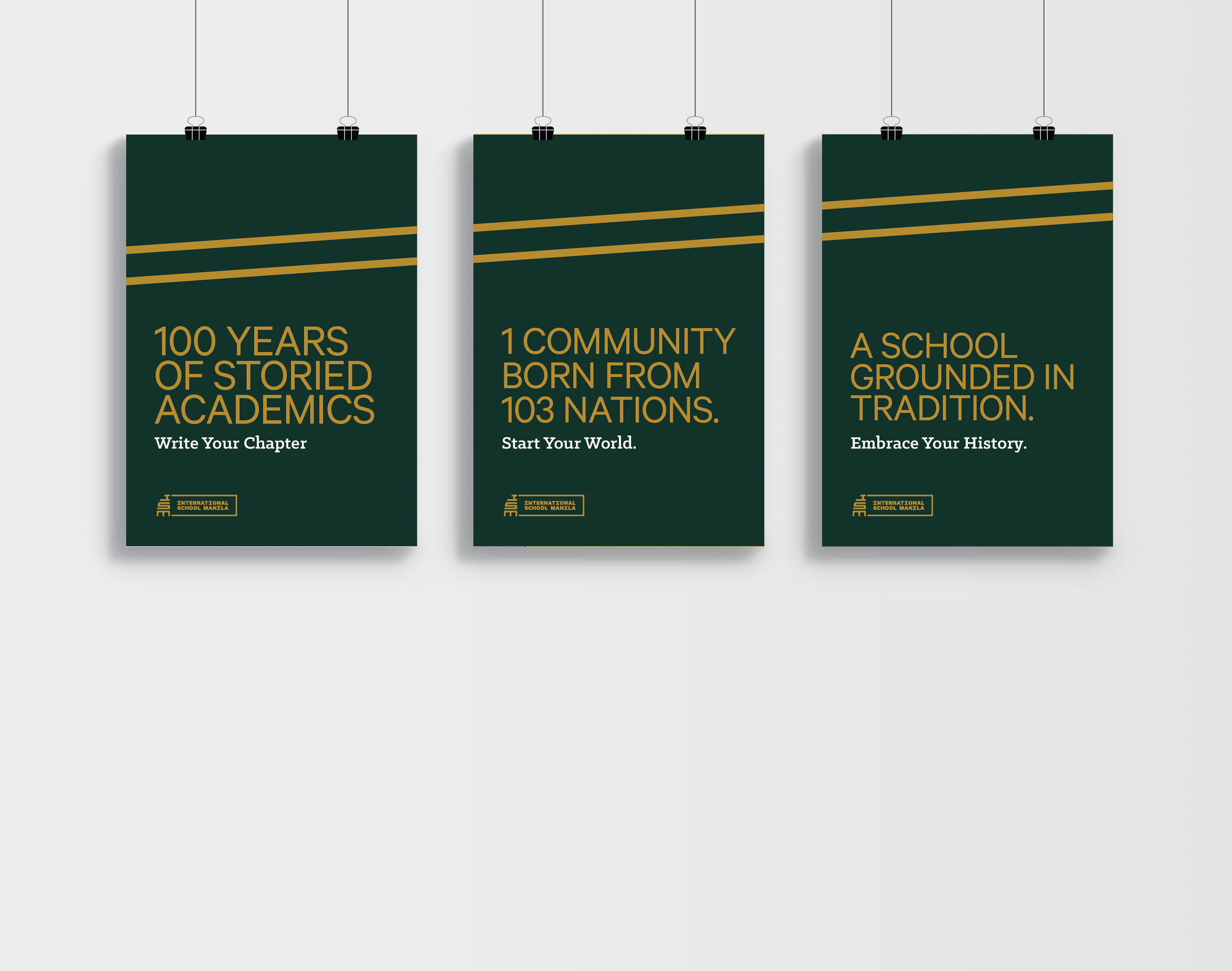
The International School Manila is just a year out from celebrating its 100th anniversary since originally opening doors as the American School Manila. Although originally established as an American school catering to American children, the institution expanded its reach in response to both Manila becoming a global trade hub and a booming international student body that valued the merits of academic rigor and prestige. This goal of this rebrand is to craft an identity that compliments the school’s modern and dynamic reputation, while also honoring the path that has paved way for the school to be where it is 100 years later.
Accolades: 2019 Best of Quarter in Branding
FUNCTION
Branding/Identity
Illustration
Logo
Art Direction

BRAND HISTORY
International School Manila (ISM) was originally founded as “The American School” in 1920 by American and British expats because they wanted to provide a curriculum that was comparable to the American school system their children were accustomed to. The school was renamed “International School Manila” in 1970 to reflect the global community that was represented at ISM. Today, 103 of 195 countries are represented at ISM, with a total of over 2300 students spread across 7 hectres in the heart of Taguig City in Manila, Philippines.
LOGO DEVELOPMENT
The brandmark for ISM should represent the diverse student body, while honoring the history and pathways that have contributed to the growth of the school. The three conceptual avenues touched on the idea of intersections, global/international identity, and heritage.

FINAL BRANDMARK
The final logo is a balance of the three original conceptual directions, staying true to the core values of the school. The shape is drawn from the unique architectural makeup of the campus, which can be used in isolation as a monogram to represent the school.


LOGO MODULARITY
The logo’s rectangular shape can be used to house internal brand departments that can be paired with the custom monospace icon set.
SAME MASCOT, NEW FACE
ISM’s mascot, the Bearcat, was redesigned to compliment the new brandmark in order to fully bring the brand to life. The logo follows a similar system to the brandmark, that adapts to be flexible with the athletic space that it will live in. The primary colors drawn from the brand’s ISM Deep Green and Gold, while adding hues unique to the athletic department, Spirit Green and Spirit Gold, that allow for further enhancement within this space.

STYLE GUIDE
Color and type communication hierarchy for internal and external brand applications.

DEPARTMENT ICONOGRAPHY
The monospace icon set can be used as an additional branding piece for the departments within ISM. The rectangular container allows for the icons to easily be tacked onto the brandmark. It is designed to be stackable and flexible to fit any space condition where the mark may live.

macro crops
These macros feature intersections of the icon set represented through line work that are zoomed at 500% and cropped to create movement and flow throughout promotional elements. These connect back to the transient nature of the student body through the literal representation of crossing paths.

Brand Applications


WAYFINDING
The rectangular box from the school’s logo can be incorporated into way-finding elements across campus.

PROMOTIONAL
Crops from the logo and iconography set will be used to tie multiple pieces together.